
Based on Pinterest’s trend-scouring tool, search interest for “colorful interiors” hit a one-year high in July 2026. This comes as no surprise to design studios that have been receiving increasingly bold color requests from clients.
Now, as we enter the last quarter of the year, keywords like “dopamine decor” and “colourmaxxing” continue to rank on search engines, reflecting a growing appetite for more colorful and expressive interiors.
Read more to discover how our studio is colourmaxxing with colorful mosaic artwork and how it ties to the broader maximalist design trend.
Table of Contents
What Is Colormaxxing?
Colormaxxing is a new name for a simple idea: using color more freely and confidently in your surroundings. Think saturated shades, unexpected combinations, palette variety, and a willingness to move beyond the usual neutral palette.
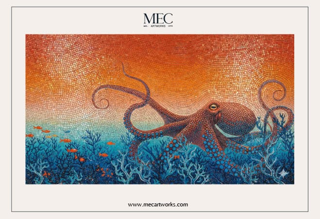
In interiors, this can mean anything from a richly colored bathroom to a patterned floor or a room where several bold shades work together.
Mosaic artwork fits naturally into this approach because it gives color more ways to work. A single design can:
- Combine several shades within one composition
- Create gradual shifts from light to dark
- Pair contrasting colors through patterns
- Bring color into unexpected areas, from stair risers and bathroom floors to backsplashes and pools
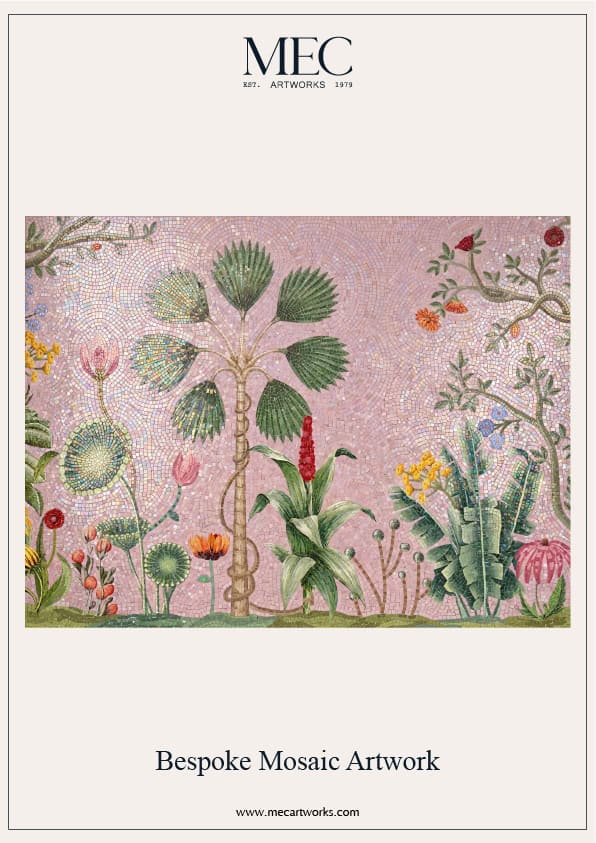
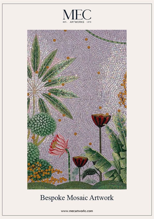
Instead of simply adding a block of color, mosaic can turn it into an image, pattern or story. For anyone drawn to colormaxxing but unsure about covering an entire room in bold paint, it offers another way to make color do more.
Why Color Is Having a Maximalist Moment
So why are we seeing more of this now?
For years, the safest interior palette was easy to recognise: warm beige, soft grey, cream, taupe and plenty of white space. Neutral interiors felt calm and sophisticated, while the rise of “quiet luxury” pushed understated materials and muted palettes even further into the spotlight.
But the mood is changing.
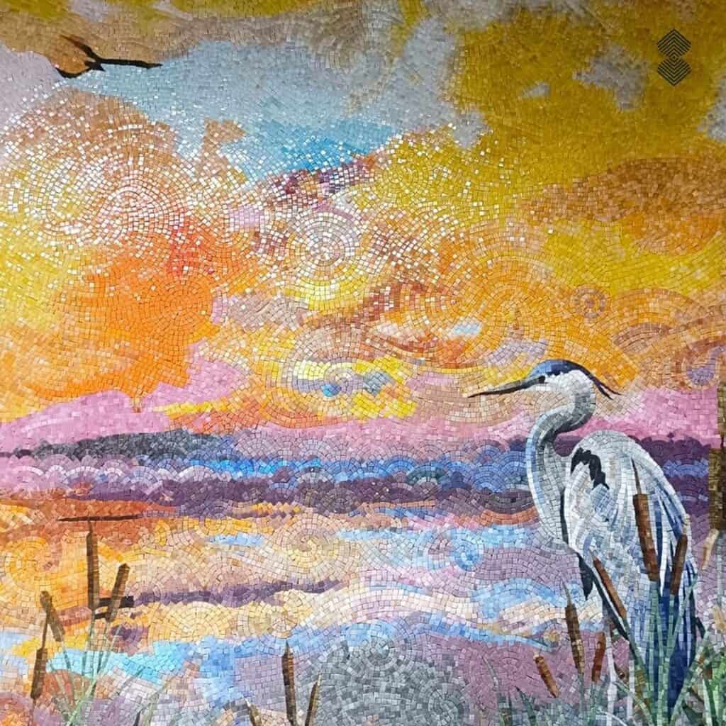
In 2026, designers and homeowners are showing a growing appetite for interiors that feel more personal, layered and visually confident. Beige has not disappeared, and not every room needs to be bright. Instead, color is simply being given a bigger role in the overall design story.
Pinterest’s 2026 color forecast reflects this shift, highlighting:
- Cool Blue
- Jade
- Plum Noir
- Wasabi
- Persimmon
Pinterest says its forecasts draw on billions of searches and saves from its 600 million users, alongside visual analysis and human curation. The colors are also assessed for their relevance across categories such as interiors.
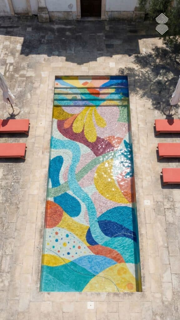
The bigger story, then, is not simply that people are choosing brighter colors. They are becoming more willing to use color as a defining part of how their homes look and feel.
Why Mosaic Takes Colormaxxing Further
Colourmaxxing is part of the wider maximalist design movement, where colour, pattern and personality are given more room to take centre stage. Mosaic is particularly suited to this trend because it allows all three to come together in one surface.
A saturated color becomes more dynamic when it is combined with contrasting shades, intricate patterns and different materials. The small scale of mosaic pieces also makes it possible to create detailed artwork without losing the impact of a bold palette.
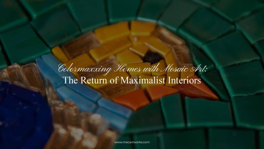
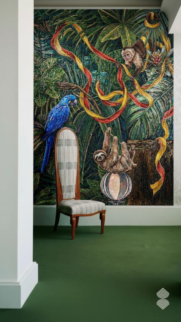
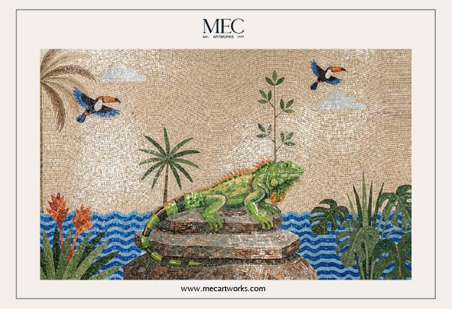
Tying together deep, jewel-toned colormaxxing with circus interior design—one of Pinterest’s highest-volume search trend predictions for 2026, our Monkey & Macaw Mosaic Wall mosaic featured below turns any room into a breathtaking main stage.
Different mosaic materials can bring their own character to a colormaxxing scheme:
- Glass mosaic: Vivid colour, shine and a light-reflective finish.
- Marble mosaic: Natural veining and variation that add depth to bold palettes.
- Natural stone mosaic: Earthy tones and organic texture for a more grounded take on maximalism.
- Stained glass: Rich, translucent colour for a jewel-like effect.
- Jade glass: Deep, luminous greens that work particularly well with nature-inspired palettes.
- Mixed materials: Combining glass, marble and stone for greater contrast and visual interest.
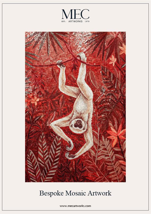
Mosaic also gives color somewhere to go. It can become a floral mural, geometric floor, decorative backsplash or pool artwork rather than simply sitting on a wall as a block of color.
Inside the Studio: How Our Designers Are Working with Colour
For the creative designers at MEC Artworks, colormaxxing is hardly a new phenomenon. Bold palettes, layered patterns and decorative compositions have long been part of how our studio approaches mosaic artwork. The difference now is that there is a name for the instinct behind much of this work: using color generously to create interiors with more personality.
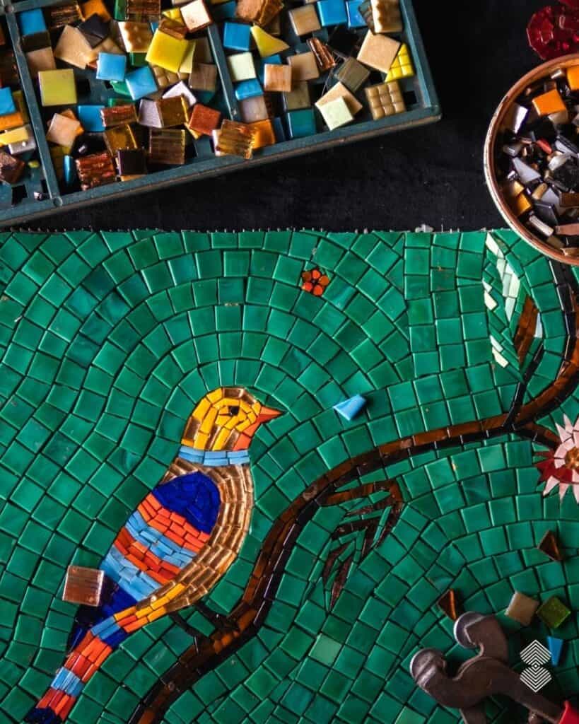
The Lulu Collection, released earlier this year, is a particularly clear example. Its mosaics bring together multiple colors and patterns, creating artwork with enough visual richness to work across both small details and larger architectural surfaces.
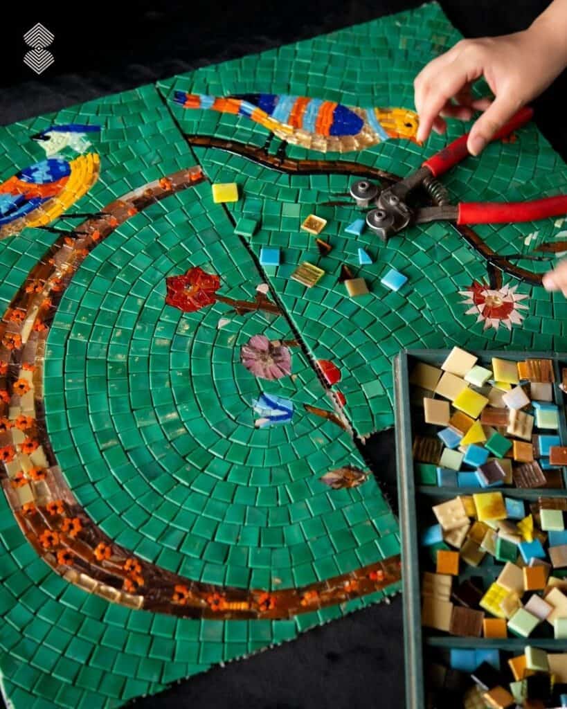
And the collection is not limited to one type of placement. Lulu designs can be used across feature walls, bathroom floors, kitchen backsplashes, vanity backsplashes, stair risers, decorative borders and pools.
This versatility makes the collection particularly relevant to colourmaxxing: colour can be introduced in a small dose through a border or stair riser, or used much more generously across a wall, floor or pool.
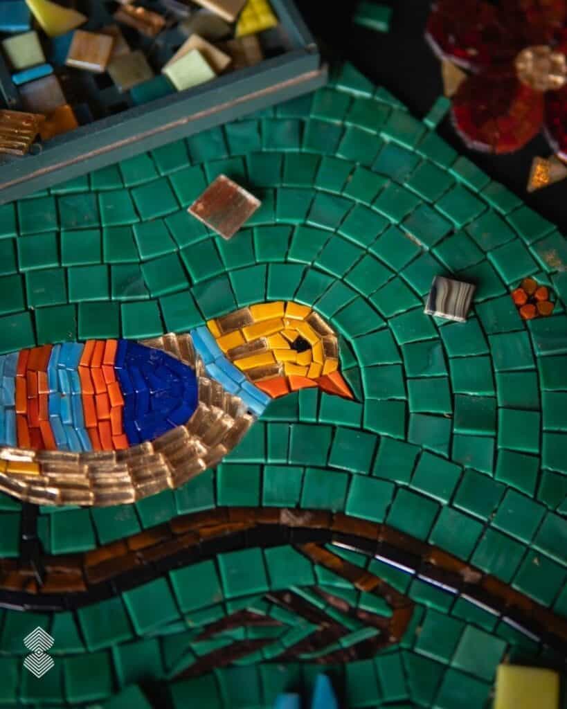
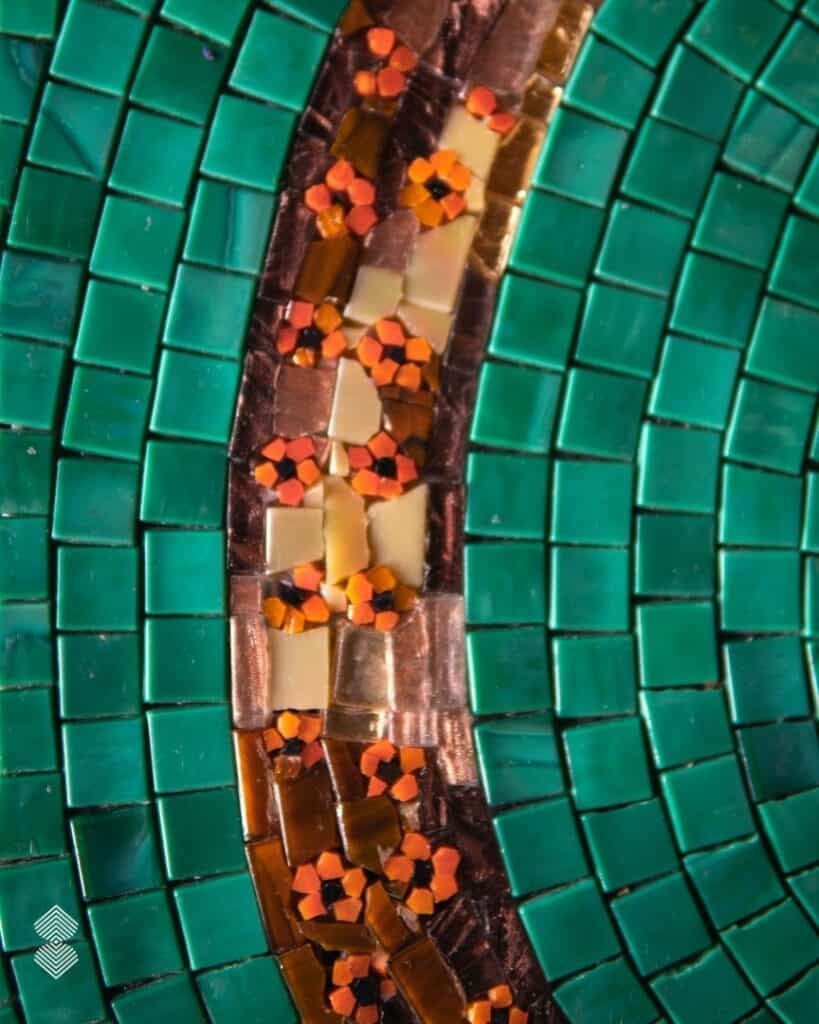
Mosaic also gives the designers another way to build colour. Instead of applying one shade across a surface, colour is assembled from individual tesserae, allowing different hues to sit alongside one another, shift gradually or form intricate patterns.
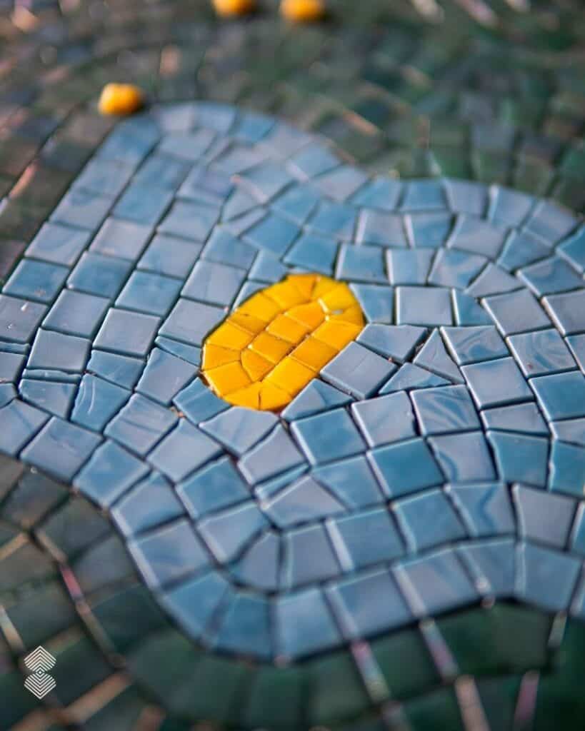
From a distance, these pieces come together as a unified artwork; up close, their individual colors and textures become part of the experience.
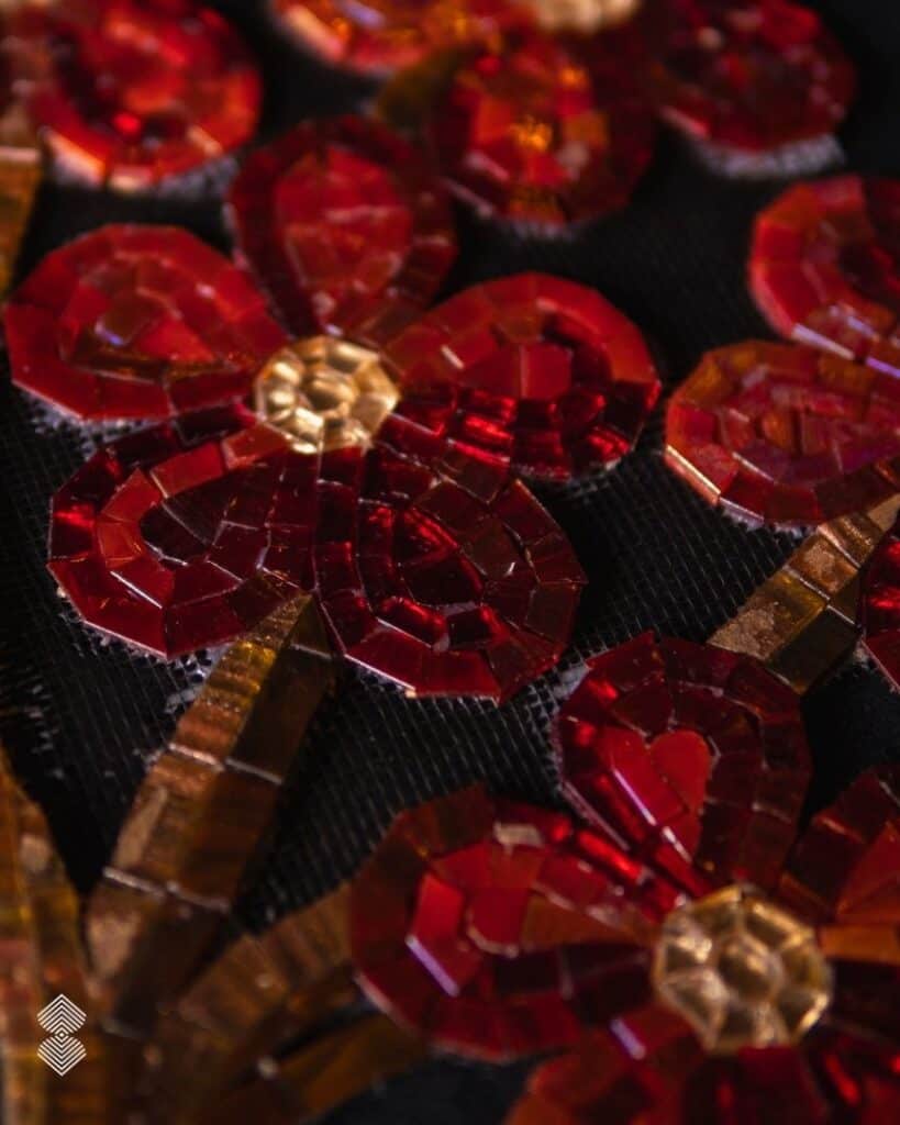
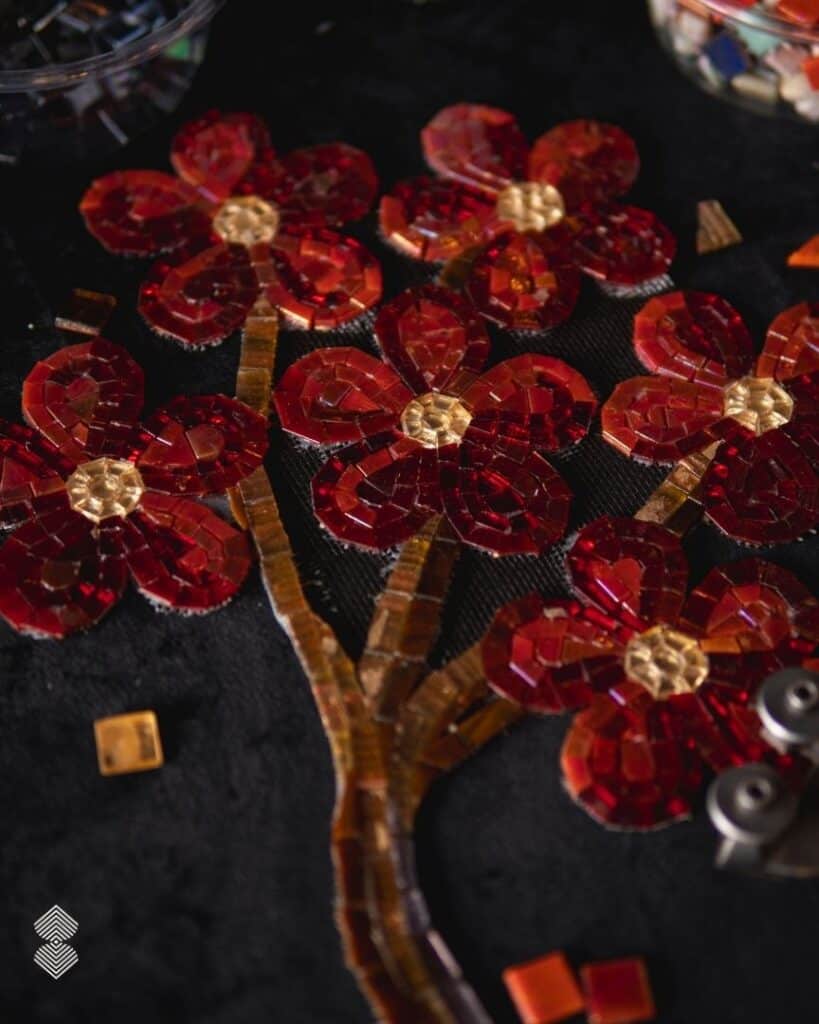
Color does not have to fill every surface to make an impact; it can be placed where it creates the most visual interest. Lulu shows how mosaic can take that idea across the interior, from the obvious feature wall to the smaller architectural details that are often overlooked.
| Maximalist trend | What it means | Mosaic Connection |
| Colormaxxing | Using color boldly and generously | Saturated mosaic walls, floors and pools |
| Dopamine decor | Designing around color, playfulness and personality | Bright, joyful mosaic artwork |
| Eclectic Interiors | Mixing styles, eras and materials | Bespoke mosaics that bring different elements together |
| Pattern mixing | Combining florals, geometrics and prints | Layered mosaic patterns and custom motifs |
| Color drenching | Carrying one color across multiple surfaces | Full-height mosaic walls and immersive bathrooms |
| Pattern drenching | Taking one or more patterns across a room | Decorative mosaic floors, walls and ceilings |
The Most Interesting Colour Combinations Right Now
Colormaxxing is not necessarily about throwing every shade onto the same wall.
It is about becoming more adventurous with colour, using several strong shades together, finding unexpected relationships between them and allowing colour to play a bigger role in the overall design.
Think juicy orange, leafy green, saturated cobalt, vivid turquoise, warm ochre and rich burgundy. Some shades are bright and energetic; others are earthy, deep or jewel-like. The interesting part is what happens when they meet.
| Color Combination | The Effect |
| Deep green + warm pink | Botanical and unexpected, with the pink bringing warmth to the richness of the green |
| Cobalt blue + terracotta | Cool and fiery at once — a particularly striking contrast |
| Burgundy + dusty pink | Deep, warm and slightly softened rather than overly sweet |
| Jade green + ochre | Earthy and mineral-like, with enough saturation to keep it lively |
| Chocolate brown + vivid blue | The brown grounds the blue and makes its intensity stand out |
| Turquoise + saturated orange | Bright, energetic and almost tropical |
| Layered greens + blue | A tonal approach that still feels colourful without relying on multiple contrasting hues |
These combinations capture something important about colourmaxxing interiors: colour does not always have to compete to be noticed. Sometimes the strongest effect comes from letting several shades build on one another.
Mosaic makes those experiments particularly interesting. A colour is rarely just one flat shade.
Why Mosaic Art Fits the New Love for Bold Interiors
People are no longer discovering interior ideas only through magazines, showrooms or designers.
This changes the way trends spread.
A homeowner does not necessarily have to decide, “I want a maximalist interior.” They might simply save a series of rooms because they love the colors. Over time, a pattern emerges in their saved images: more green, more pattern, more saturated blues, more decorative surfaces.
That is one reason social platforms can accelerate the move towards more personal interiors.
Trends can be measured by keyword search volume. The design inspiration HQ (Pinterest) predicted some interesting keyword searches last year that were to popularize in 2026.
For example, “Circus-Interiors” got a whopping 130% expected increase in volume back in the predictive report last year. Almost a year later and maximalism design is in full bloom.
Colourmaxxing: A Passing Fad in Interior Design?
Will colourmaxxing still be a thing a few years from now? The name itself may not.
Like many internet-born design terms, colourmaxxing could eventually be replaced by the next catchy phrase. But the shift it describes is broader than a social media trend.
After years of restrained palettes, designers and homeowners are showing a renewed interest in color, pattern and interiors that feel distinctly personal.
This is where mosaic has an advantage. A mosaic does not depend on a trend name to remain relevant. Its colour can be changed, layered and composed into artwork that is personal to the space.
Whether the current vocabulary is colormaxxing, maximalism or simply expressive design, the underlying desire is the same: to create interiors with more character.
Perhaps, then, colormaxxing is less about making every room colorful and more about giving ourselves permission to choose color without playing it safe.
And that is a design instinct unlikely to disappear anytime soon.
What does colormaxxing mean?
Colormaxxing is less about choosing bright colors and more about being deliberate with color. Instead of keeping color to accessories, designers might use it across joinery, ceilings, stone, upholstery, artwork and architectural surfaces.
In practice, a colourmaxxed interior could be surprisingly restrained: a room might use several shades of green across the walls, marble, furniture and mosaic, creating a tonal interior rather than a rainbow of competing colours.
How can I make my home more colorful?
Start by identifying the least-used visual surfaces in your home. In many luxury villas, walls and floors are kept deliberately neutral while color is confined to furniture.
Look instead at the opportunities created by the architecture:
The underside of a staircase
A double-height entrance wall
A window reveal or niche
The inside of a pool
A bathroom ceiling
A decorative floor border
These are places where color can have a strong effect without competing with the main living areas.
What colours work well together in interiors?
Look at temperature, depth and proportion, rather than following a fixed color wheel.
A useful approach is to pair one dominant color with a quieter architectural neutral and one unexpected accent. For example, dusty pink + limestone + oxblood feels very different from using three equally saturated colors.
Is mosaic art suitable for modern interiors?
Yes, because contemporary mosaic is not limited to classical imagery or ornamental patterns. A modern interior can use pixelated artwork, oversized geometry, monochromatic gradients, irregular shapes or highly simplified line work. Even an intricate image can feel contemporary when it is scaled appropriately and paired with restrained architecture.
One advantage of mosaic is its ability to translate artwork into a permanent architectural surface. Instead of hanging a painting on a wall, the wall itself can carry the composition.
Where can mosaic art be used in a home?
The more interesting question is which surfaces benefit from permanence and detail.
Mosaic is particularly effective where a homeowner wants something that cannot simply be replaced like furniture or accessories. That makes it suitable for:
Pool interiors: underwater artwork, medallions and borders
Entryways: custom floors and large-scale walls
Bathrooms: shower walls, vanity surrounds and niches
Kitchens: backsplashes and decorative bands
Staircases: risers, landings and adjacent walls
Outdoor areas: fountains, terraces and water features
For bespoke commissions, the design can also be developed around an exact architectural dimension. This means an artwork does not have to be cropped to fit a standard tile format; the composition itself can be created for the wall, floor or pool it will occupy.