
Carolyn’s 70s-Inspired Kitchen Counter Base Mosaic with Custom Lettering
“When you reduce a design to one word, every decision becomes more visible. Spacing, tone, and alignment all need to be resolved early”
— MEC Design Team
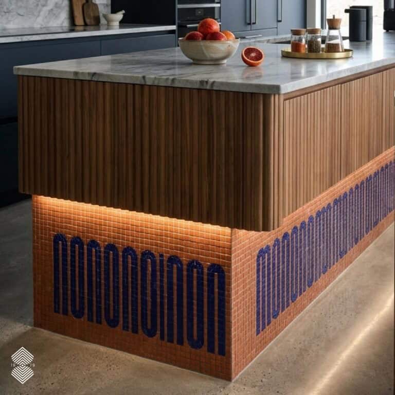
Using a single word—“WOW”—and a contrasting color palette, the design relies on proportion and material finish rather than layered imagery.
When we collaborated with Carolyn and designer Gillian of Wondernose, the mandate was clear: execute a 70s-inspired typography mosaic for a kitchen installation. The feature, a bold architectural statement, was designed to wrap across the counter base.
Carolyn’s 70s-Inspired Kitchen Counter Base Mosaic with Custom Lettering
MEC ARTWORKS • Audio Episode
Client Brief
The brief was to create a custom mosaic featuring the word “WOW” integrated into the base of a kitchen counter. Gillian, designer from Wondernose, had a clear idea of the color palette from the beginning.
However, standard glass tile ranges did not provide the exact tones required.
“The color needed to sit properly within the kitchen. We looked at several options, but nothing standard was quite right.”
— Nada, Lead Design Consultant
Because typography depends on contrast between text and background, the selection process involved several iterations. Having worked on typographic mosaics extensively in the past, our design team took up the challenge of finding the right color combination.
Nada worked closely with the designer to manage this process.
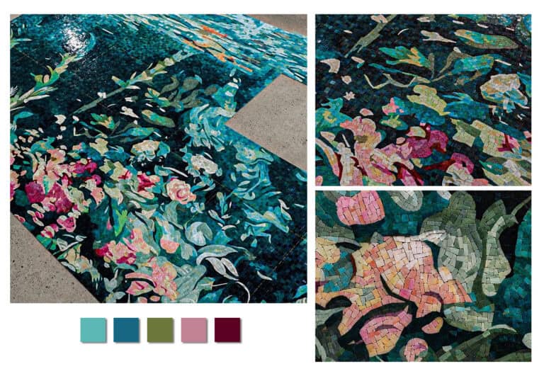
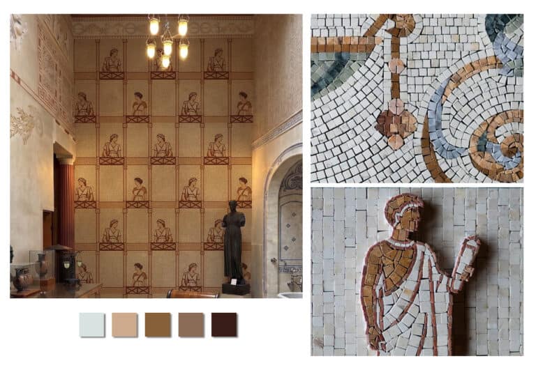
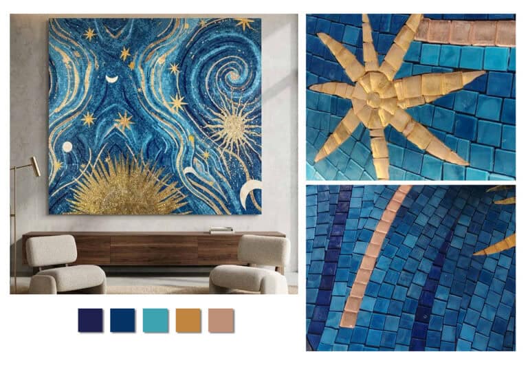
Inspiration Moodboard
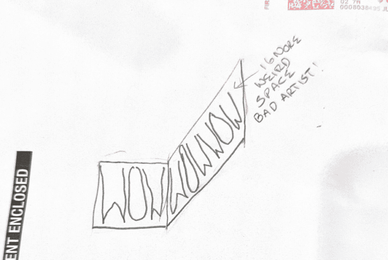
The lettering wasn’t taken from any existing font; it was custom-drawn for the mosaic itself. It follows a tall, narrow design that was carefully planned to align with a 10×10 mm tile grid.
These iterations helped narrow down the direction but also confirmed that existing materials were limiting the outcome.
At one stage, sourcing external tiles was considered due to the level of specificity required. To address this, Nada introduced the Opus range—Venetian enamel tiles—which offered a broader and more controlled color range compared to standard glass mosaics.
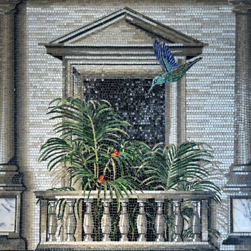
We ultimately resolved the palette in-house using our own stock. Learn more about our Opus Venetian Enamel tile range in this visual reference from our archive.
Design Development
Initial Sketches
A physical moodboard was prepared so the client could review the materials directly rather than solely relying only on digital visuals.
2D & 3D Visualizations
To support final decision-making, the selected colors were also presented in reversed layouts, switching text and background, to compare both options clearly.
Color Palette & Materials
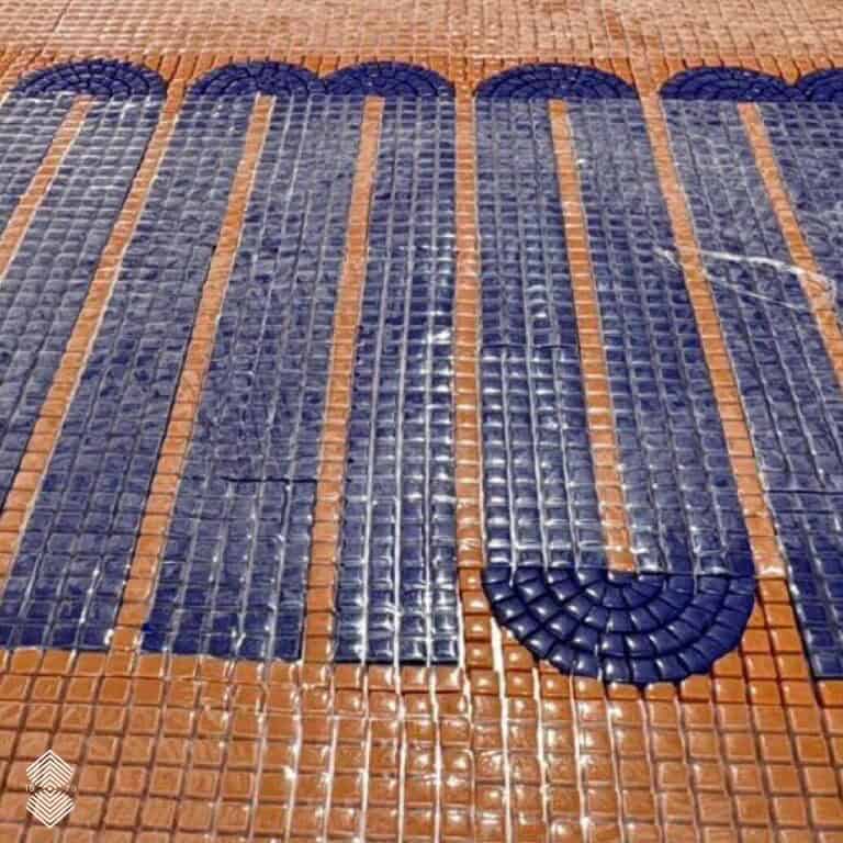
The Opus tiles allowed for :
- Greater depth of color
- Smooth, beveled surface
- Suitable for high-use areas such as kitchens
Production
After approval, the design moved into fabrication. Even for a single word, execution required:
- Accurate alignment of letterforms
- Consistent spacing across the layout
- Clean transitions along curves and edges
“Typography needs to match the approved layout exactly. Small shifts can change how it reads.”
— MEC Production Team
Once completed, the mosaic was prepared and shipped to Carolyn’s location with installation guidance to ensure correct placement.
“The counter base is an interesting surface for mosaic work because it sits at eye level in everyday use, turning what is usually a transitional or overlooked zone into a clear point of visual engagement.”
— Design Team
The result is a retro typographic wrap that settles into the space without effort, held together by material clarity and a sense of contrast.
The finished panel spans roughly two meters in width. Its deep blue lettering sits against a warm terracotta background
“Whether it’s a logo for a retail environment or a word integrated into a home, the challenge is always the same—translating letterforms into a material system without losing clarity”
— Design Team, MEC
We often work across a range of typographic approaches depending on the environment the piece will live in. For more informal, social settings such as cafés, we tend to use softer, more open letterforms like GT Alpina or Recoleta, which carry a sense of ease and approachability without losing clarity at distance.
This project is part of a broader range of typography, logo, and signage mosaics produced by MEC. For more examples and technical insights, you can explore additional project stories on our blog.
FAQs
What should I consider when searching for custom typography or logo mosaic work in 2026?
We always recommend clients think in terms of environment first (kitchen, hospitality, retail, or public signage), because typography behaves differently depending on lighting, distance, and surface texture. The more precise the brief, the more refined the final execution.
You should also consider pricing. Our mosaic cost guide can be a helpful reference.
What are common mistakes people make when commissioning logo-based mosaic or signage work?
One of the most common issues we see at MEC is treating typography as purely graphic rather than spatial. Many clients approach us after searching “convert logo into mosaic tiles” without considering grid alignment or material constraints.
The main challenge is that logos designed digitally don’t always translate cleanly into physical tile systems. Stroke weight, spacing, and curvature often need to be re-engineered. Without this step, the final output can lose clarity or visual balance, especially at architectural scale.
How does signage design change for hospitality or retail projects in New York?
In New York, signage and typographic installations tend to prioritize density, speed of readability, and strong brand recall.
At MEC, we approach these projects by focusing on high-contrast compositions and structured type systems that remain legible in fast-moving environments. Unlike residential work, hospitality signage in NYC must perform instantly—there is no time for visual interpretation delays.
Can typography-based mosaic designs be adapted for small-scale residential interiors?
Yes, and this is an area we’ve seen growing demand for. The key is proportion. Unlike large commercial signage, residential typographic mosaics require tighter control over spacing and scale to avoid visual clutter. Material selection also becomes more tactile, as viewers experience the piece at close range.
Verified Client Reviews & Experiences
Posted on Google
 Chad Asarch
Trustindex verifies that the original source of the review is Google.
Very responsive and easy to work with on the design process - production happened sooner than anticipated. Love the finished product!Posted on Google Colinda Le GallWonderful tiles and great experience. Buying mosiacs and tiles via a high quality service was the best decision here. The team especially Nada, we're helpful from design to delivery. Thank you for being part of building our home! 😍Posted on Google
 Matt DanielNada and the team at MEC did a fantastic job with our kitchen backsplash! We loved the Erassa design on their website and they were very accommodating with updating it to reflect our own preferences. After making a number of tweaks and approving the final design, we received the completed mosaic earlier than expected and packaged very well. The installation went smoothly and we love looking at it every time we enter our kitchen!Posted on Google
 Lauren AustinZeeha and the entire Mec Artworks team were excellent to work with! I can't recommend them enough. We talked to lots of different companies when designing the custom mosaic for our pool, and Zeeha and her team were prompt, professional, and group we felt most comfortable proceeding with. We couldn't be happier with the quality of their end-product! The mosaic turned out beautiful, the communication through the process was reliable, and the installed mosaic is the centerpiece of the pool we were hoping for.Posted on Google
 Mellanie AskewFantastic designs and super easy to work with..Posted on Google
 Abbi SternI found MEC online searching for a mosaic Persian rug for my bathroom. I found the Este Custom Marble Persian Mosaic Rug and loved it the way it was but the sizing needed to be tweaked a little. Nada got back to me right away and was extremely helpful with making the necessary adjustments to maintain the integrity of the rug to fit the space. Nada sent samples, videos and a thoughtful presentation of of the piece with mock ups of how it would look in the space. We were so thrilled with how the rug turned out. I am still waiting for the full install but could not be more pleased with the whole process, communications and quality of MEC's work. I would highly recommend MEC to anyone who is thinking about a mosaic piece. Nada, Zeeha and team were a true pleasure to work with. (Pictures to come!)Posted on Google
 Christa StewartWonderful communication and sent samples in a timely manner! Can't wait to see our design installed!Posted on Google
 Kristina LeaIt has been a wonderful and fun experience to work with MEC on the design and execution of our kitchen mosaic. Nada was prompt and thorough with her replies, always giving us in-depth understanding and explanation when needed. We felt reassured throughout the whole process. Nada made sure that the end mosaic met our complete expectations. We were looking for more than a backsplash, and the mosaic created by MEC is truly a piece of art. This was an investment that not only pulled the room together, but also highlights a stunning piece of creativity. Very reasonably priced for the quality, beauty, and piece of art made with unique composition and creativity. Would do this again and again with MEC!Posted on Google
 Kirsten BurtonWe have now completed two projects with MEC. The results on both a large bath and full kitchen were outstanding. The design team was a pleasure to work with, they completed and delivered ahead of schedule, and the quality of the murals truly added a unique and high-quality to the rooms. I will look forward to working with them again.Verified by TrustindexTrustindex verified badge is the Universal Symbol of Trust. Only the greatest companies can get the verified badge who has a review score above 4.5, based on customer reviews over the past 12 months. Read more
Start Your Custom Mosaic
Inspired by this transformation? Share your vision with our studio — and let MEC Artworks craft a bespoke mosaic that reflects your style, space, and story.