As we begin to ease into 2026, home decor and art take a significant place, as they always do. This blog gives us insight into the top mosaic colour palettes for Interiors and Exteriors in 2026. Home is where the heart is, and so this place where our heart truly resides needs to be warm, welcoming and elegant all at once. We aim to provide an overview of what is in and what is not, regarding home mosaic decor.
Table of Contents
Top Mosaic Colour Palettes for Interiors in 2026
A variety of selections and ranges are trending in 2026 as to mosaic art in the Interiors of living spaces. They offer colours and patterns suited to the unique tastes of different individuals.
The top-trending colours are
- Warm Earthy Browns/Oranges
- Muddy Greens
- Beige and Taupe Neutrals
- Blues, Reds and Greys
- Vibrant Neon Hues
Brown and Orange Mosaic Colour Palettes for Interiors
Being surrounded by warm, earthy colours like shades of brown and orange helps us to feel calm and grounded, effortlessly. Floor and wall mosaics in terracotta, clay, sand, and ochre evoke a sense of contact with the bare ground, which is both calming and anchoring. This makes them a top mosaic colour palette
Earthy colours also serve to uplift the beauty of natural materials like wood and stone. They also pair extremely well with synthetic materials like ceramics. Thus, a harmony is created within the entire space with each material complementing the other.
The overall effect is pleasing to the eye without being too loud or bold.
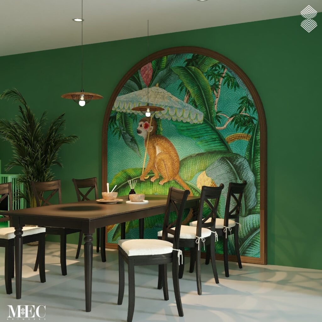
Why Green Mosaic Colour Palettes, Make Serene Interiors
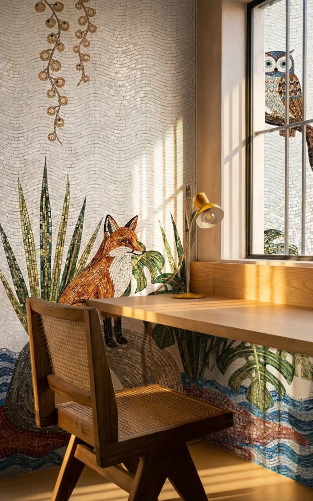
Another set of colours which are an all-time favourite amongst clients are muddy green shades like sage, moss and olive. These organic shades have the undertones of continuity and freshness of life. Greens generally depict plants, which are also a message of living things in bloom.
Earthy greens also bring a sense of calm to the space. Greenery has always had a soothing effect on humans, helping them to relax and unwind. This make them a top mosaic colour palette choice. Such shades are ideal for the interiors of homes which do not have a garden or direct view of any greenery.
Greens also permeate a message of calm, wellness and focus, things that all homes should ideally provide to their occupants. Mosaic art in these shades is a fantastic idea for spaces used for meditation, exercise or studying, as they help calm the mind and develop focus.
These Greens may be perfectly paired with
- Creamy Whites
- Neutrals
- Wood colours
- Charcoal
- Other darker shades
This makes them easily usable in any setting.
Although trending currently, Muddy Greens are always in trend as top mosaic colour palettes. A shade that is never outdated.
Neutral Mosaic Colour Palettes for Backdrops and Features Areas
According to GIRA LIFESTYLE & INTERIOR, Beige, Taupe and similar neutral colours lend a hand to the background of mosaics, adding subtlety without disturbing the effect of the central mosaic patterns. They are generally employed in the outlines of mosaics with the more striking colours in the middle to make the effect more dramatic through contrast.
With Neutrals in the background, the primary part of the mosaic is more in focus and may be appreciated. They help to reduce visual noise of the background by automatically shifting one’s gaze to the darker colours.
As border colours, they might have a backseat in importance as compared to the main colours of the mosaic but they do an indispensable job of bringing those main colours to attention.
Neutral may come into play as the main colour of choice in a mosaic too. This happens when the space to be designed is limited, and tranquillity is the need of the moment. Easy on the eye and elegant without being overpowering, Neutrals lend beauty, neatness and serenity to any space.
Like Muddy Greens, Neutrals are also a preferred choice in mosaic colour trends in 2026. They are here to stay. Their value in the backdrop and foreground of mosaics makes them an everlasting choice in mosaic hues.
Primary materials used for these colours in mosaics are stone, recycled glass and ceramic tesserae.
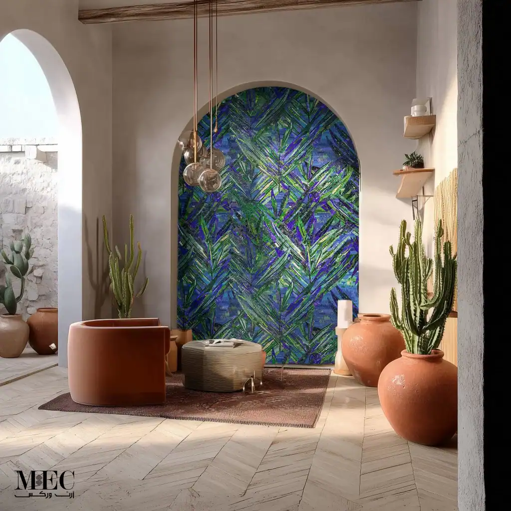
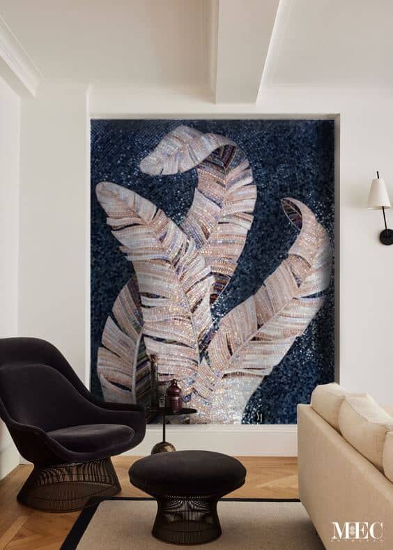
How to Use Flamboyant and Saturated Accents (Blues, Reds and Greys) in Interiors
Sometimes mosaics are there to show energy, vitality and vibrance. That is when saturated accents come into operation.
For those who like to make more of a bold style-statement, jewelled accents of blues, reds and greys take more of a central stage as top mosaic colour palettes.
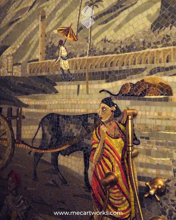
Splashes of Smoky Jade, Teal or Oceanic blue or Cobalt blue within a mosaic for more of a flair. Deep plum, burgundy and rich ruby red in reflective smalti (opaque, richly coloured glass tiles) or metallic glass tiles. Charcoals and dull blacks may be used as outlines to accentuate the middle part of mosaics.
These colours make viewers sit up and pay attention to the fixture. Not all mosaics give the message of restfulness and calm. Sometimes the message to be given is one of action or emotion.
Flamboyant accents in mosaics give the message of depth and energy without causing visual heaviness. As compared to a heavily painted wall or brightly coloured flexes, deep hues inspire boldly but at the same time, elegantly. These rich colours may be used to brighten and liven up an architecturally flat space, too.
Using Vibrant Neon Hues in Interiors
For a bolder and more modern look, Electric Fuchsia and Green Glow hues are in style, creating futuristic mosaics, inspired by digital art.
As expected, these ‘Instagrammable’ designs are more popular with Gen Z as a favourite choice in mosaic colour palettes. They embody a nostalgic value for Gen Z, as it was in the 90s that striking Neon hues were first featured on screens, in high-fashion clothing and so on.
Neon hues in 2026 are a reaction to the decades of mosaic art in Beiges, Whites and Greens.
Compared to painting, Neon hues can be used much more effectively and artistically in mosaics. A wall covered in Electric Fuchsia or Green Glow may be too loud or overwhelming. However, in mosaic art, the energy of these colours is displayed in an attractive and controlled manner.
Transformative Teal as Mosaic Colour of the Year
Transformative Teal is a vibrant, fluid blue-green colour that depicts energy, motion, and a connection to nature. It bears the paradox of being an in-vogue shade, but also gives a timeless sense of balance and serenity. It has been named the 2026 colour of the Year by trend forecasters WSGN and Coloro.
Mosaics in Transformative Teal are top trending for their two-fold message. They signify the in-depth, calm and resilient beauty of the oceans. At the same time, they also denote the turbulent, majestic energy of those waters.
To add a touch of shine and shimmer, shades of gold, bronze and brass are used on warm metallic glass. These royal hues give a sense of luxury, reflectiveness and add to the aura of any interior. They also hold the power to simultaneously depict old-age grandeur and modern retro style. The warmth and glow of these colours portray comfort, elegance and brightness.
Out in the Open (Best Mosaic Colour Palettes for Exteriors)
This section delves into how mosaic art can further beautify the exteriors of homes, be it in gardens, outdoor kitchens, facades and patios. The colours trending in 2026 for exterior mosaic art are
- Clay and Taupe
- Warm Beige and Sand
- Warm Whites and Creamy Neutrals
- Natural Greens and Blues
- Light (Creamy Whites & Beige) Versus Darks (Charcoal and Orange)
Using Clay and Taupe Mosaic Colour Palettes in Exteriors
Paired best with natural surroundings of stone, brick and wood, Clay and Taupe hues merge well and add grace in exterior mosaics. They blend in with their environment and add a stylishness to any outdoor decor very subtly. As mosaics in these shades mimic outdoor materials, they lend a quiet beauty to their surroundings without actually calling out for attention.
Clay and Taupe are best utilised in boundary walls, entrance walls or courtyards. They also work beautifully in the
- Exteriors of Villas
- Garden walls
- Outdoor stair risers
- Patio surrounds.
Another excellent reason for using these colours in outdoor art is that these colours don’t give way to weathering easily; in fact, natural elements just render them more unique and beautiful by making them gel with their environment in a more natural way. Weathered corners and rubbed off edges make these structures look even more genuine in their setting, making them a top mosaic colour palette choice.
Why Warm Beige and Sand Mosaics Are a Great Choice for Exteriors
Another fantastic choice for outdoor mosaics, Warm Beige and Sand are light colours that respond very well to play with sunlight. According to DesignCafe, they are a great selection as mosaic colour palettes on sunlit exteriors or the main outside wall of a house. These colours also serve well to harmonize and blend with their surroundings. In league with Clay and Taupe, they merge with their background, too.
Warm beige and Sand also have a welcoming note in their hue and thus are amazing shades to be used as mosaic colour palettes, for the entrances of homes to give a friendly, hospitable feeling to guests and hosts alike. These muted tones are friendly to the eye and are being increasingly used in exteriors.
Warm Whites and Creamy Neutrals for Exteriors
A good option that ages gracefully and hides the effects of natural elements on it. An all-time favourite at any age and time, Warm whites are a popular choice for mosaic art in 2026, especially in places where the sun is strong and the weather is dry and dusty.
Warm whites tend to reflect sunlight, absorbing some of it and make the glare less harsh. The result is a soft, warm glow. Neutrals work well at hiding dust as compared to their stark counterparts. Yellowing also takes place at a much slower speed, making them an obvious choice.
Then again, the colour White itself is a symbol of elegance and grace, and muted tones of White just seem to symbolize its qualities more strongly.
Natural Greens and Blues for Shaping Your Exteriors
Greens
A set of colours borrowed straight from nature, which is a top colour palette choice for outdoor mosaics. Natural Greens include
- Eucalyptus
- Moss
- Olive
- Sage
They harmonise with the greenery in the environment. They set a tone of calm and relaxation, as does an environment with trees and plants (Walker V Painting Exterior Colour Trends for 2026).
Blues
Blues favoured in exterior mosaic also tend to be the more organic shades of
- Slate
- Mineral
- Denim
- Soft Teal
They lend elegance and refinement to the mosaic.
These natural shades also fade slowly, and even as they do, their faded versions go well with the natural Blues and Greens in their periphery.
As per the latest trends, Blues and Greens generally take up the border area of the mosaic. They may be used in varying shades, moving from the darkest to the lightest or vice versa. The Creamy Whites and Beige take up the central part of the fixture.
Contrast in Exteriors (Light Hues Versus Dark Ones)
A classic art and design principle, now trending again. Contrast in mosaics refers to the use of opposing colours, like White with Charcoal or Blue with Orange to make an immediate, eye-catching statement. Such mosaics aim at arresting the viewers’ attention and keeping it.
A more vibrant approach to hue selection, Contrast is also used in mosaic signs to ensure their readability and make them stand out in general. They are also popular in pool-side tile mosaics with fish or sea plants being depicted in the mosaic.
Conclusion: Wider Mosaic Colour Palette Selection Depending Upon Depth and Personal Expression
Interiors are live-in spaces where we spend most of our time. Exteriors are what we come in contact with when we walk out, be it our home, offices or educational space. Each item and fixture there should aim at dispensing comfort, positive energy and flow.
The following trends stand out for mosaic art in Interiors and Exteriors.
- Preference of warm and earthy tones over stark shades.
- Balance in combination of jewelled accents and neutrals.
- Choice of colours according to the depth and personality of the space owner.
Frequently Asked Questions
Will the shade look exactly the same once the mosaic is installed?
Not exactly. Mosaic colours are influenced by lighting, surrounding materials, tile finish (matte or glossy), and grout (cement-based filler applied between tiles)colour. That’s why it’s important to view samples in the actual space or under similar lighting before finalising shades.
Should the mosaic blend in with the space or stand out as a feature?
This depends on the design goal. Neutral or earthy shades help mosaics blend seamlessly into interiors and exteriors, while contrast colours and accents are used to highlight focal areas like backsplashes, feature walls, pools, or murals. Hue selection should be done while keeping the ultimate goal of the fixture in mind.
Will the mosaic colours fade or change over time outdoors?
High-quality mosaic materials such as glass, ceramic, and natural stone are designed to be colour-stable. However, lighter and earthy tones tend to age more gracefully outdoors, while intense colours are best used in Interiors and covered spaces to maintain long-term visual balance.
How many colours should be used in a mosaic for the best visual effect?
A balanced mosaic typically uses one dominant colour, one or two supporting shades, and a contrasting hue. This approach creates depth, improves readability, and prevents the design from feeling cluttered or overwhelming.