Storybook-Inspired Mosaic Mural for a San Francisco Home
This artful project, featuring a 19th century townscape, color-drenched in blue, is one of our most interesting commissions yet.
This mosaic was creatively designed for a client in San Francisco, it captures a 19th-century townscape with an illustrative charm. Its stunning blue palette, enriched with subtle gold details, creates a storybook-like feel. The piece also features a horse, adding a touch of life to the streetscape.
This wall mural is reminiscent of a scene from Belle’s village, rooted in French architecture and a lively ambiance, leaving admirers starry-eyed.
This project also offered a chance to reflect on how contemporary mosaic designers are evolving in their practice. Themes like refined color palettes, integrated architectural flow, and narrative-driven layouts align closely with current directions in the field, many of which we explore in Mosaic Design Trends for 2025. It’s a helpful reference for understanding how traditional inspiration and modern design thinking meet in work like this.
In this case study, we share insider details from the creative process. We look at initial sketches to installation, giving a behind-the-scenes look at how this piece came to life.
Research, Sketches, and Exploration
The project began with research and exploration. The client wanted a dream-like illustration for this statement piece mural. We started with a pencil sketch showing a street lined with old-time commercial properties set against a larger-than-life countryside backdrop.
The first sketch went through a few rounds of adjustments, especially the engravings on the building frameworks. We wanted the landscape to reflect real-life architecture from the 19th century. We experimented with the font, the text layout, and even the wording itself. The goal was to create something that felt like a postcard or storybook illustration. Serif lettering was an option we finalized. The sketch became the blueprint for the wall mural.
Storybook-Inspired Mosaic Mural for a San Francisco Home
MEC ARTWORKS • Audio Episode
Inspiration Sources
The design for this mosaic was shaped by a mix of cultural and artistic influences. The town’s architecture took cues from vintage European buildings, specifically those from the 18th and 19th centuries. We looked at how façades were structured, worked out the process of translating it onto mosaic, the patterns of windows and balconies, and the understated details that gives historic towns their character. These minute details helped create a sense of authenticity in the streetscape.
We also looked at broader creative references and contemporary wall-mosaic ideas, which helped us refine how these different visual traditions could centralize within a single composition. For the backdrop and overall composition, we drew from East Asian landscape traditions as well as the decorative, nature-infused motifs characteristic of chinoiserie. Their approach to layering hills, trees, and open space instructed the way we framed the town within its countryside setting. This direction helped us showcase the architectural elements with natural scenery, giving the mosaic a realistic feel.
The final outcome is a piece that feels grounded in history yet otherworldly.
Architecture in Focus: Designing with Precision
In this mosaic, the architectural details were executed with killer attention to detail.
Some key points we paid attention to include:
- Juliet balconies and large windows were hand-drawn with proportion in mind to make the buildings feel authentic.
- Brick-faced walls and stone detailing added realism, creating visual intrigue across the streetscape.
- The roof shapes, cornices, and trims were all designed to reflect historical styles while keeping a balanced look.
- Attention was given to perspective so that buildings felt correctly placed within the town.
Bit by bit, the mosaic material took the building’s shape and grew into a finished wall mural.
Color Palette: How We Chose the Blues
The mosaic uses a mostly monochromatic blue palette. This gives the piece a calm and cohesive feel while unifying all the architectural and natural elements. The decision to color-drench this mosaic was risky but totally worth it.
Gold details were added sparingly to make hidden features prominent. They draw attention to elements like windows, balconies, and the horse, without breaking the overall structure of the design. We layered different shades of blue. Darker blues suggest shadows and distance, while lighter tones bring certain areas forward. This layering gives the streetscape a three-dimensional feel, making the townscape feel alive even though the colors remain limited.
Some challenges came up during the process. Balancing the detailed architecture with natural elements like trees, hills, and the horse required multiple adjustments and correspondence with the client. Ensuring the monochromatic blue palette didn’t feel flat was another concern. We refined the piece by:
1. Adjusting shading to add contrast
2. Varying tile sizes for subtle texture
3. Fine-tuning tile placement for depth
These refinements helped the mosaic feel dynamic while keeping its calm, storybook quality.
Historical Context: A Nod to Timeless Design
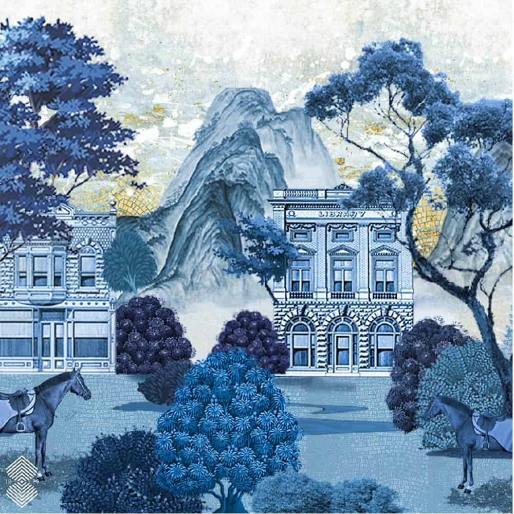
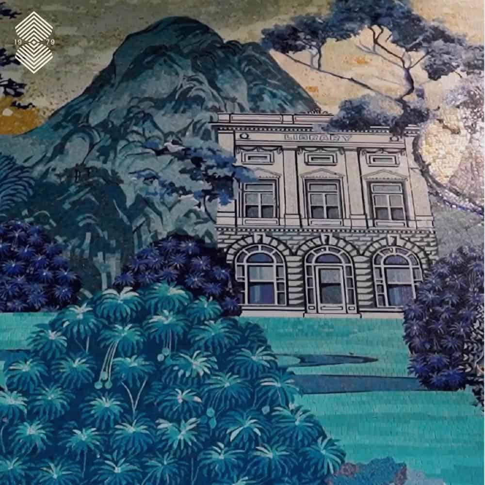
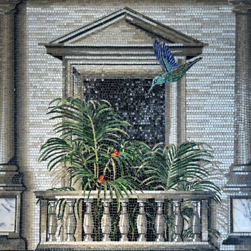
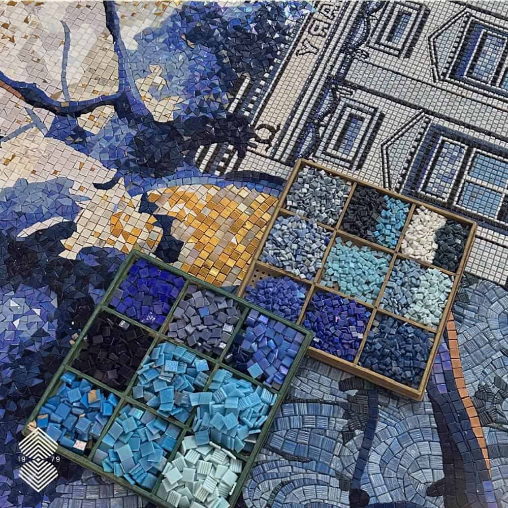
The design of this mosaic was shaped by historical architecture and materials. The buildings reflect the style and character of 18th-19th century towns, from brick façades to classic window designs. At the same time, the piece includes elements that make it feel timeless rather than tied to one period. By blending historical accuracy with creative interpretation, the mosaic balances authenticity with imagination, giving viewers a sense of familiarity while still feeling like a dreamlike scene.

A Mosaic That Tells a Story
Working on this project highlighted the value of informed planning and detailed sketching before beginning the mosaic itself. Material selection and technique also proved crucial in achieving depth and texture. The process reinforced that a successful mosaic combines multiple elements like architecture, landscape, and subtle narrative details. Even without words, the scene can communicate life, movement, and story, showing how thoughtfulness in each step contributes to the overall impact.
The design team spent time considering how grout would influence its final appearance. In glass mosaic art, the right grout color can either sharpen contrast or create an atmospheric flow, an essential choice that shapes how light interacts with the work.
The townscape mosaic is both timeless and approachable, showcasing history and creativity into a single artwork.


