Crafting 'Be Here Now' - A Handcut Typographic Mosaic Wall Art
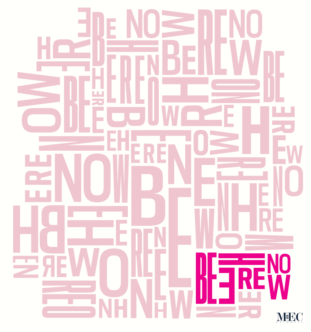
When Gillian Pinchin, Wonder Nose Ideas and Design in Larchmont, NY, approached us for a unique bathroom mosaic, she had a vision: a dynamic word cloud that could transform a wall into a mantra. She envisioned a bathroom wall that would speak volumes—literally and figuratively—with the phrase “Be Here Now” in varying shades, prominently featuring a vibrant pink.
Caption: The typographic mosaic design concept for Gillian’s client’s bathroom wall
Crafting 'Be Here Now' - A Handcut Typographic Mosaic Wall Art
MEC ARTWORKS • Audio Episode
The Initial Concept: Two Bold Color Choices
Gillian’s vision for the mosaic was clear: a design centered around the phrase “Be Here Now,” repeated across a background in two potential color schemes. The first option featured a lively yellow background, radiating energy and warmth, while the second option was more subdued with a beige background, offering a calming, neutral feel. In both designs, the words were primarily in a single color, except for one key detail: the bottom left corner where “Be Here Now” was highlighted in a vibrant pink. This pop of color was meant to draw attention, emphasizing the mosaic’s central message.
Caption: Word Cloud Typographic Art for mosaic wall art as shared by Gillian
Choosing the Right Tiles: A Process of Exploration
To bring Gillian’s vision to life, we knew the colors and materials had to be just right. We started by preparing sample boards with various tile options for the yellow and beige backgrounds. These samples were carefully selected to showcase different shades and textures, helping Gillian visualize how each color would look when crafted into a mosaic.
We sent the samples to Gillian and eagerly awaited her feedback. She appreciated the range of options but had some concerns. The pink shade we used wasn’t quite what she had in mind, and the iridescent finish on the yellow tiles, though visually interesting, wasn’t her preference. It was clear we needed to adjust our approach.
Caption: The initial mood boards with the proposed glass tile colors sent to Gillian by mail.
Navigating Challenges: The Search for the Perfect Match
At this stage, Gillian introduced us to some tiles she found on Etsy that matched her vision for the mosaic. The colors seemed promising, and we considered sourcing these new tiles to achieve the exact shades she wanted. However, sourcing these tiles presented its own set of challenges. The time required to find and ship the right tiles was longer than we had anticipated, and there was another problem—the thickness of the Etsy tiles didn’t match the Murano and Vertex tiles we typically use. Mixing tiles of different thicknesses could potentially create an uneven surface.
Caption: The updated digital mood boards with revised tile color options
Given these constraints, we decided to take a different route. We turned to our own extensive stock of glass mosaics, hoping to find the perfect shades. After sifting through countless samples, we found what we were looking for—a vibrant pink that matched Gillian’s vision and a beige that complemented the overall design. Not only did these tiles match her color specifications, but they were also of the same quality and thickness as our existing Murano and Vertex tiles, ensuring a seamless finish.
A Collaborative Effort: Meetings, Photo Calls, and Approvals
With the new tile samples in hand, we set up several meetings and photo calls with Gillian to discuss the updated options. We wanted to make sure she was fully on board with the new colors before moving forward. During these discussions, we shared detailed photos and videos of the tiles, showing how they looked in different lighting conditions and how they would work together in the mosaic.
Gillian’s feedback was crucial during this stage. She carefully reviewed the new samples and appreciated the effort we put into finding the right match. After a few rounds of discussions and adjustments, she gave us the green light to proceed with production. We were thrilled to have her approval and excited to start bringing her vision to life.
Caption: Behind-the-scenes photos of the ‘Be Here Now’ typographic mosaic being handcrafted at the MEC workshop
Bringing the Mosaic to Life: The Art of Production
With the final color palette approved, our team began the meticulous process of crafting the mosaic. Each piece of glass was carefully cut and placed, ensuring that every element was aligned with Gillian’s design. The word cloud took shape slowly, with the vibrant pink phrase in the bottom left corner standing out beautifully against the beige background.
Creating a mosaic is like putting together a puzzle, but with the added challenge of making sure every piece not only fits but also contributes to the overall aesthetic. Our artisans worked with precision and care, taking the time to ensure each tile was positioned perfectly. It was a labor-intensive process, but seeing the mosaic come together piece by piece was incredibly satisfying.
Caption: Freshly completed ‘Be Here Now’ typographic mosaic
Stay Tuned for the Final Reveal!
We’re eagerly awaiting the installation of the ‘Be Here Now’ mosaic, and we can’t wait to see it in its new home. Keep an eye out for our next update, where we’ll share photos of the mosaic in place, adding a touch of art and inspiration to the space. In the meantime, if you’re as fascinated by typographic mosaics as we are, check out this brilliant listicle by Design Boom featuring amazing typographic mosaic tile artworks by Nick Misani. We’re sure you’ll be inspired!
Got mosaic typography on your mind? Check out our logo and signage mosaics page for some fun ideas. If you’re dreaming up a typographic mosaic for your space, shoot us a message for a free design consultation. We’d be thrilled to brainstorm with you!

